Brief
Incodet is a software development company focused on turning ideas into scalable digital products, including websites, mobile applications, SaaS platforms, and custom software solutions.
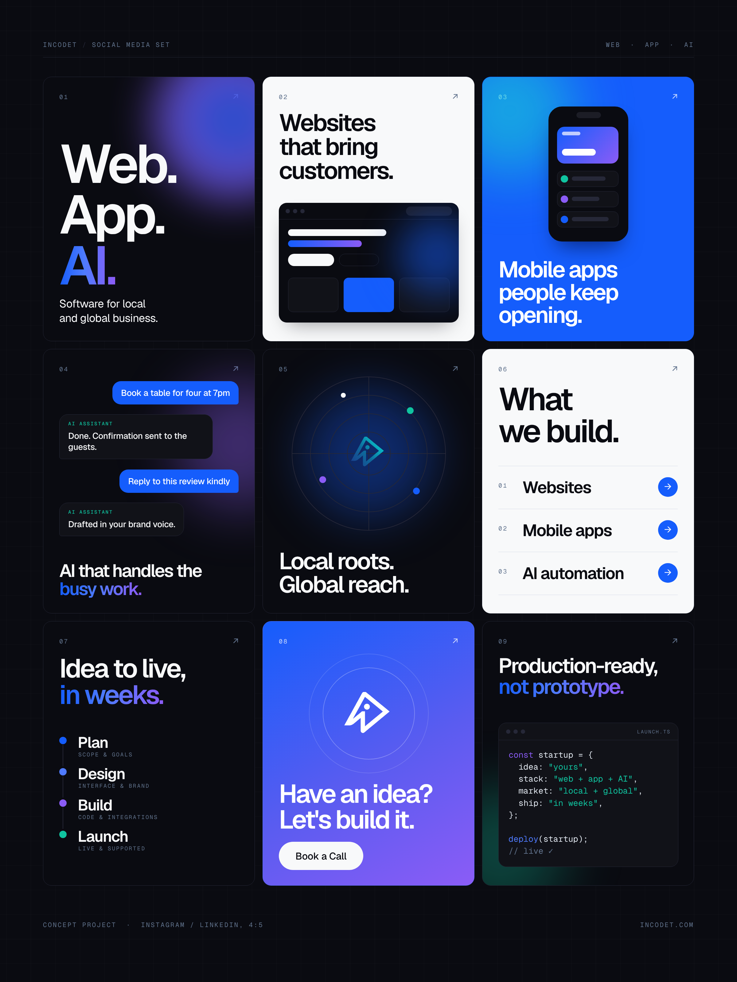
This project explores how Incodet can communicate its services, capabilities, and brand personality through a cohesive collection of social media graphics.
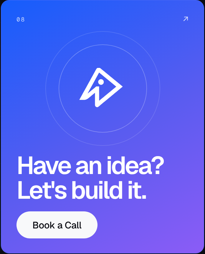
The goal was to create a set of visually consistent yet individually distinctive posts that introduce the brand, communicate its offerings, explain its development approach, and encourage potential clients to start a conversation.
Rather than treating every post as an isolated design, I approached the collection as a unified social media series built around Incodet’s existing brand identity.
The Challenge
Software development can be difficult to communicate through static graphics. Technical services often involve complex processes, abstract concepts, and features that may not be immediately clear to a potential client.
The challenge was to make Incodet’s services easier to understand while keeping the designs visually engaging and consistent with the company’s technology-focused identity.
Each graphic needed a clear message, a strong visual hierarchy, and enough variation to keep the collection interesting. At the same time, the designs needed to work together as a recognizable brand presence across social media.
Creative Direction
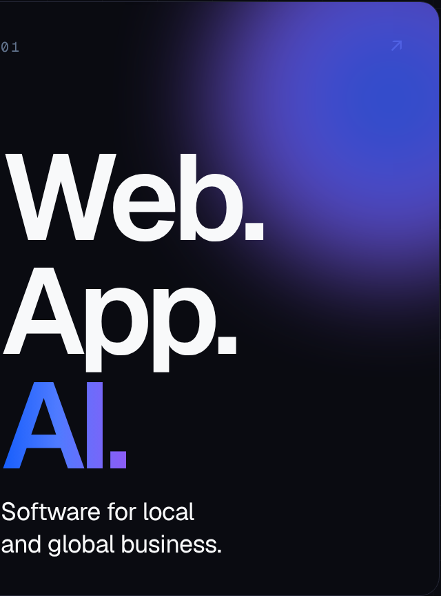
The creative direction builds on Incodet’s established visual identity, using a dark-first color palette, electric-blue accents, bold typography, subtle gradients, and clean interface-inspired elements.
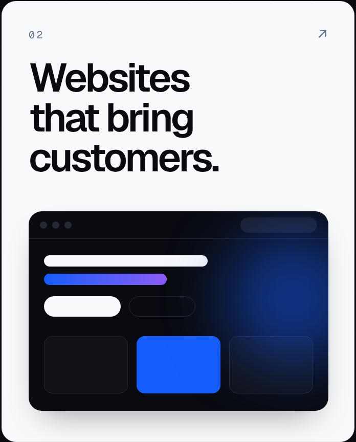
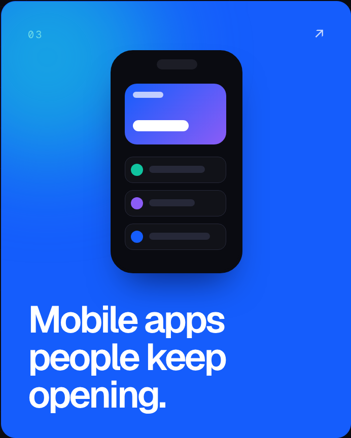
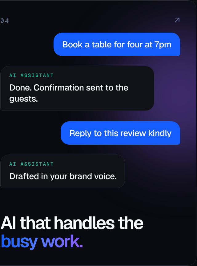
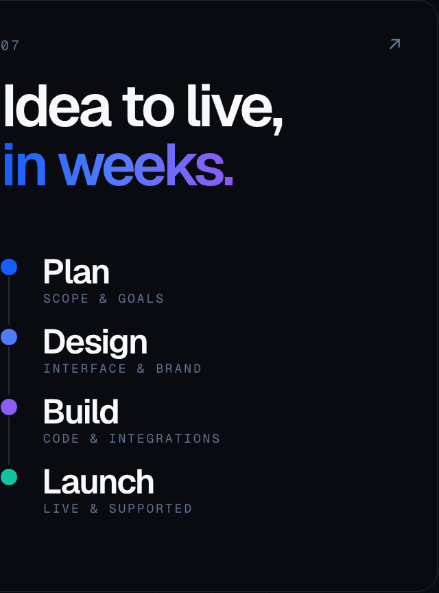
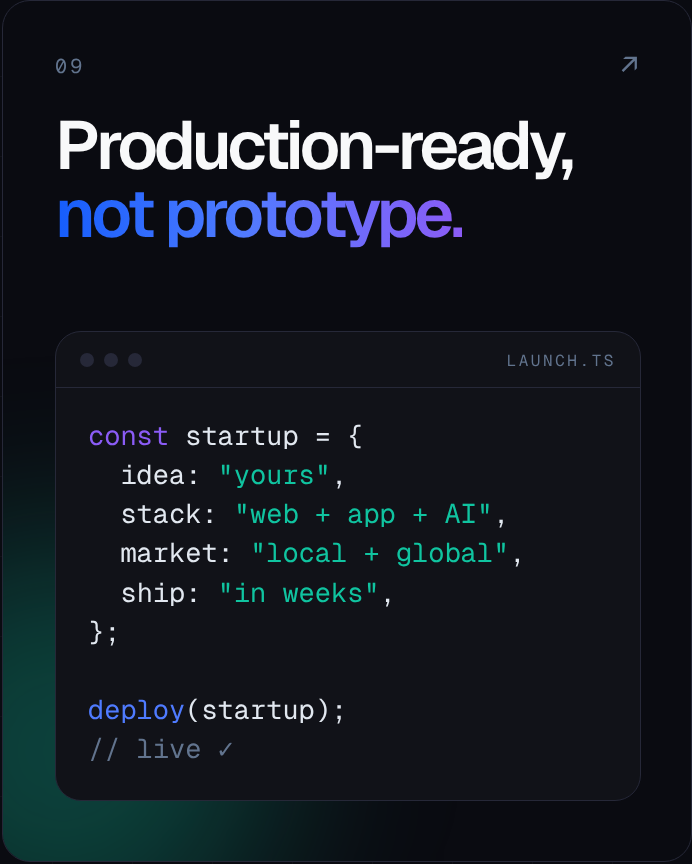
I explored a balance between minimal layouts and more expressive compositions. Some designs focus on large headlines and concise messaging, while others use interface mockups, workflow diagrams, and graphic elements to communicate specific ideas.
The series uses a combination of dark backgrounds, light editorial-style cards, and blue-to-violet gradients. This variation helps distinguish different types of content without losing the overall brand identity.
The visual language is intentionally modern and structured, reflecting Incodet’s work in software development and digital product creation.
Design Objectives
The project was guided by four main objectives:
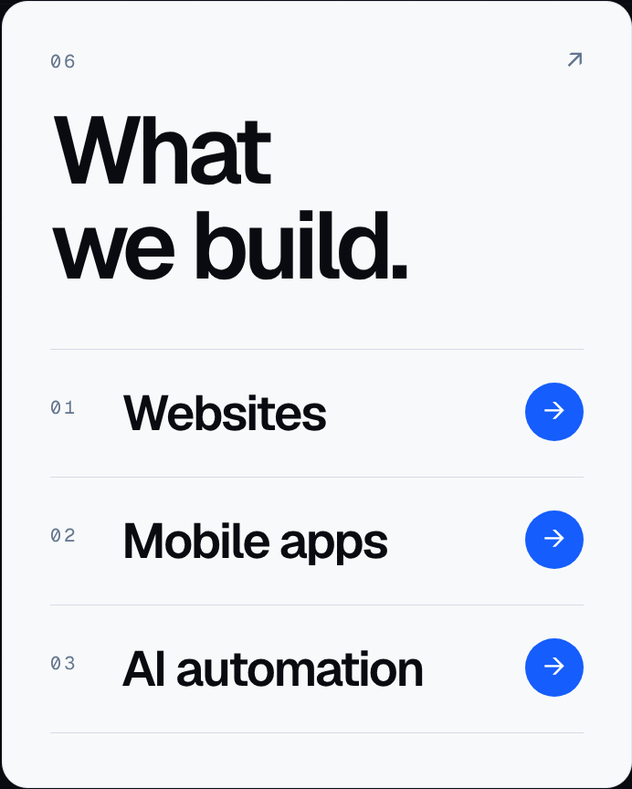
- Communicate services clearly: present web development, mobile applications, SaaS products, and AI automation in an accessible way.
- Build brand recognition: apply the established Incodet logo, typography, colors, and visual elements consistently.
- Create content variety: explore service introductions, educational messages, process explanations, technical visuals, and calls to action.
- Encourage engagement: use concise headlines and clear next steps to make the graphics suitable for marketing communication.
Visual System
Consistency across the nine graphics was achieved by applying the same underlying brand rules while allowing each post to communicate its message differently.
- Colour — the core palette uses Ink (#0A0B11), Electric (#155DFC), Violet (#8B5CF6), Teal (#10C4A0), Slate (#62748E), and Mist (#F8F9FA). Dark backgrounds establish the technology-focused foundation. Electric blue highlights important messages and interface elements, while violet and teal provide selected contrast and variation. Light-background layouts are used selectively to create visual rhythm throughout the collection.
- Typography — bold sans-serif typography establishes the main headlines, while smaller supporting text provides context without competing with the primary message. Large type treatments help the posts communicate quickly in a social media environment. Compact labels, numbering, and technical-style details introduce structure and reinforce the identity system.
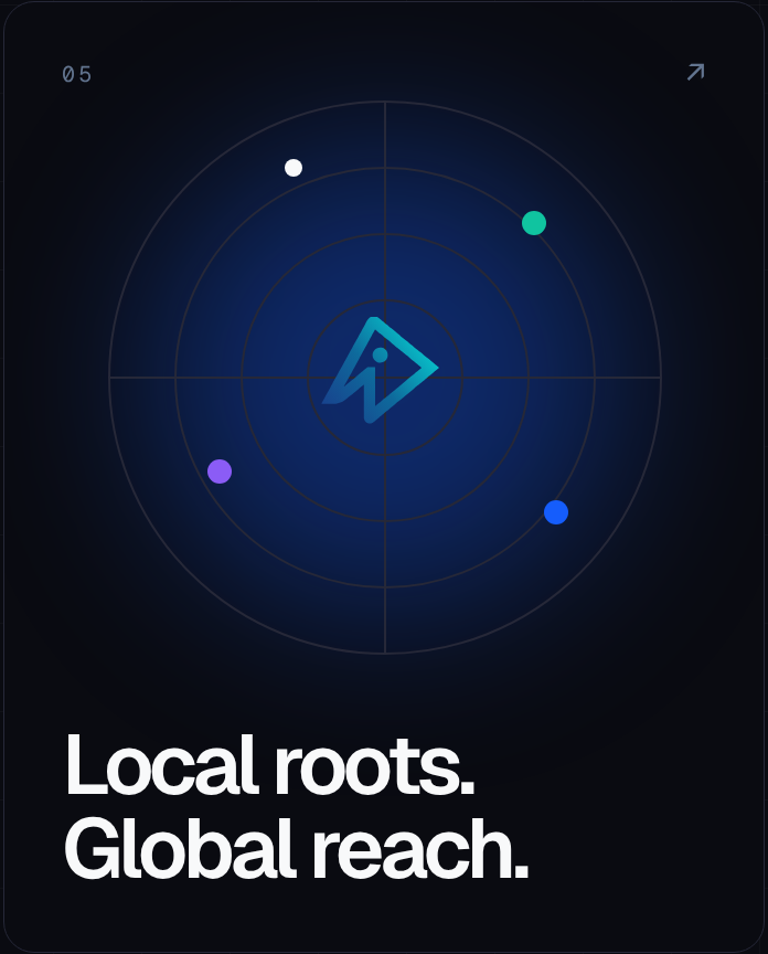
- Layout and composition — the collection uses rounded cards, subtle borders, structured grids, interface-inspired elements, and controlled negative space. Some graphics rely on typography as the main visual element, while others use mockups, diagrams, timelines, or lists. This variation helps each post serve a different communication purpose within the same visual system.
- Brand consistency — the Incodet symbol, established palette, and recognizable typography connect the individual concepts. Consistency comes from shared visual rules rather than repeating the exact same layout nine times.
Design Process
The process began with the Incodet brand identity and design system as the foundation for the social media series.
I then developed a range of content concepts around the company’s services, positioning, development process, and potential client actions.
Each concept was organized around a primary message and a supporting visual. I explored how typography, color, and layout could reinforce that message, then applied the established brand rules to maintain consistency across the collection.
The final stage focused on creating a balanced sequence of graphics, mixing bold promotional posts with informative layouts and technical visual treatments.
The Outcome
The result is a nine-post conceptual social media set exploring how Incodet can present its services and communicate its brand identity through different types of content.
The collection includes brand introduction, service promotion, AI automation messaging, company positioning, process explanation, and lead-generation concepts.
Together, the designs demonstrate how a consistent brand system can support a varied social media presence without making every post look identical.
The project also provides a foundation for future content, allowing additional graphics to be developed using the same visual principles.
Key Takeaway
Effective social media design requires more than a visually attractive graphic. Each post needs a clear communication goal, a well-structured layout, and a recognizable connection to the brand.
Through this project, I explored how a single visual identity can support different messages across an entire content series, balancing consistency with variation and visual impact with clarity.
The result is a flexible design direction for presenting Incodet’s services in a modern, approachable, and visually cohesive way.
Project details
- Project
- Incodet Social Media Design Set
- Brand
- Incodet
- Project Type
- Concept social media campaign
- Deliverables
- Nine social media graphic concepts
- Intended Platforms
- Instagram and LinkedIn
- Format
- Portrait, 4:5 aspect ratio
- Focus Areas
- Social media design, digital branding, art direction, typography, visual hierarchy, content design, and service promotion