Brief
Incodet is a software development company focused on turning ideas into scalable digital products, including websites, mobile applications, SaaS platforms, and custom software solutions.
This project explores how Incodet can promote its services through a collection of digital advertisements, conceptual posters, and an informational flyer. The goal was to communicate the company’s value, make its services easier to understand, and create visually engaging marketing materials that remain consistent with the established brand identity.
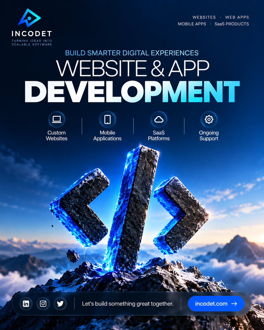
Rather than using one layout for every design, I explored several creative directions, from minimal typography-led compositions to cinematic 3D imagery, interface mockups, and structured service layouts.
Each piece serves a different communication purpose while maintaining the same foundation of typography, color, branding, and visual hierarchy.
The Challenge
Software development services can be difficult to communicate through static advertising. Potential clients may know they need a website or digital product but may not understand the possibilities, the development process, or how a software partner can help.
The challenge was to turn these services into clear, visually compelling messages without relying on lengthy technical explanations.
At the same time, the designs needed to work across different formats and creative approaches. A service flyer should be informative and easy to scan, while an advertising poster needs a strong focal point and a memorable headline.
The task was to balance clarity, visual impact, and brand consistency across the entire collection.
Design Objectives
The project was guided by five main objectives:
- Communicate services clearly: present website development, mobile applications, SaaS products, AI automation, and custom software through accessible messaging.
- Build brand recognition: use Incodet’s logo, color palette, typography, and visual language consistently.
- Explore different creative directions: combine minimal layouts, bold gradients, conceptual visuals, and interface-inspired compositions.
- Support different marketing needs: develop materials that can serve as social media advertisements, promotional posters, and informational flyers.
- Encourage action: incorporate clear calls to action that invite potential clients to learn more or discuss a project.
Creative Direction
The collection builds on Incodet’s established brand identity: a modern, technology-focused visual system built around dark backgrounds, electric-blue accents, clean typography, and controlled gradients.
I explored three complementary visual directions.
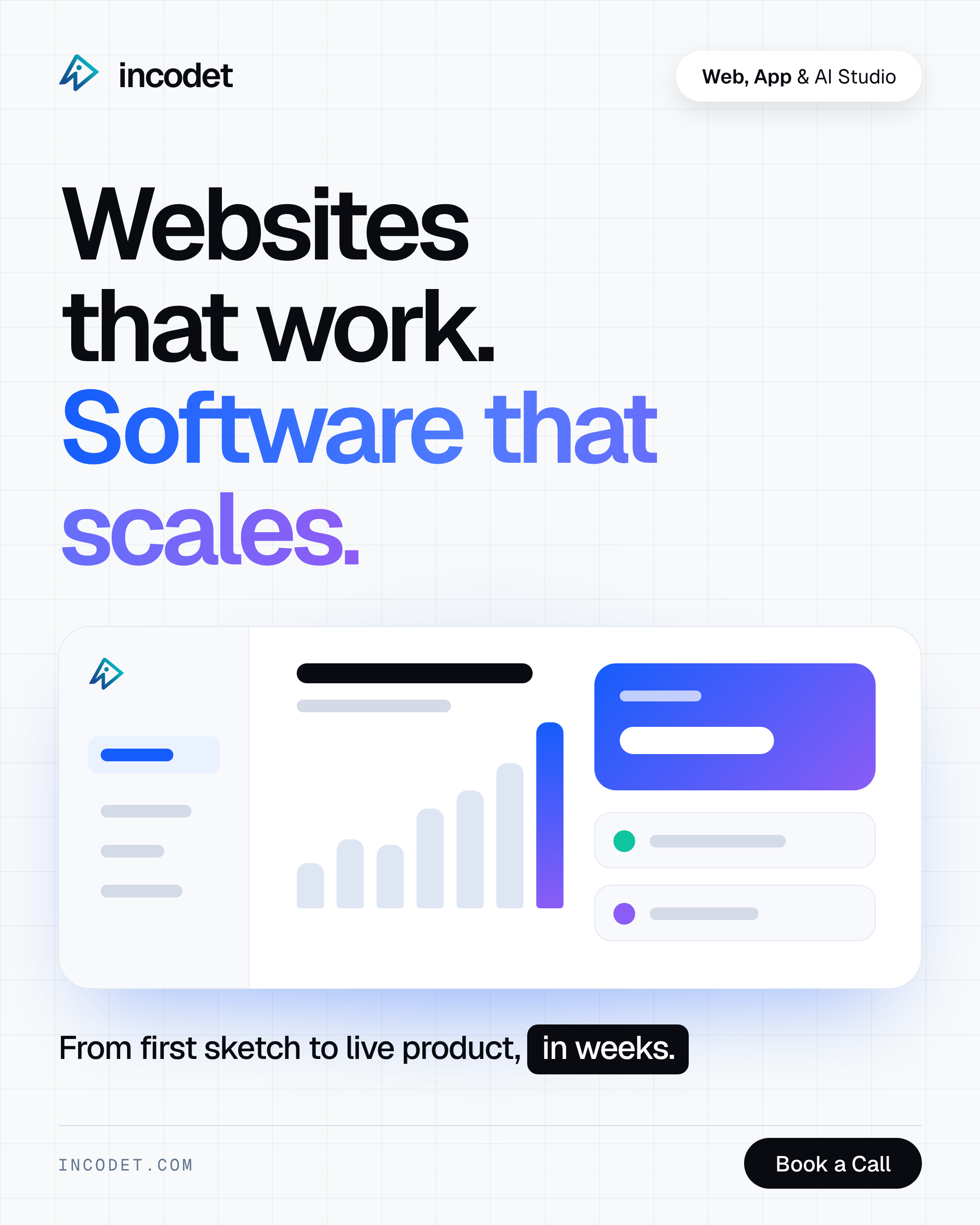
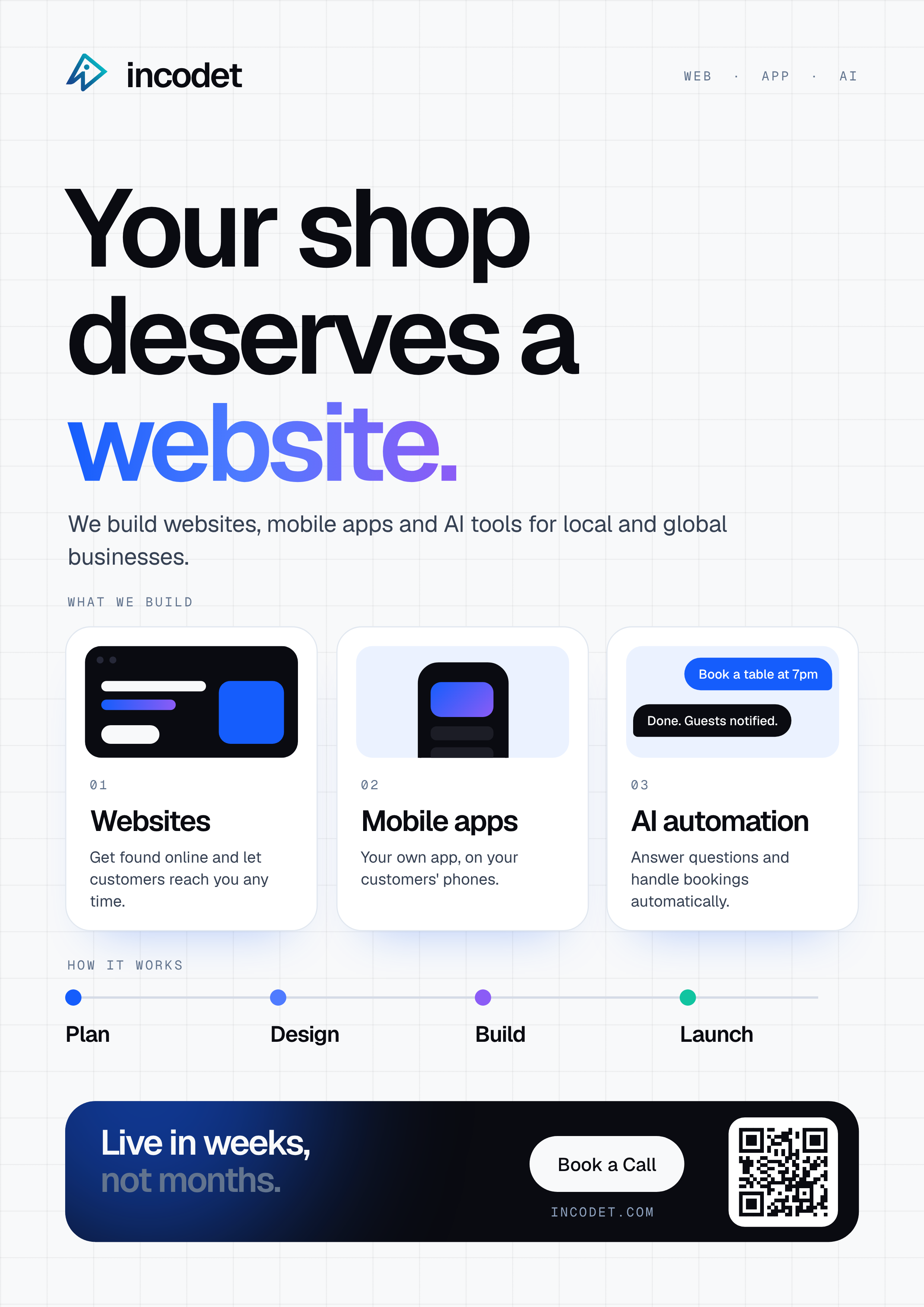
- 01. Clean and informative — light backgrounds, subtle grid patterns, rounded service cards, interface mockups, and structured content make information easier to navigate. The compositions are designed to communicate Incodet’s services quickly, making them suitable for informational graphics and service-focused advertising.
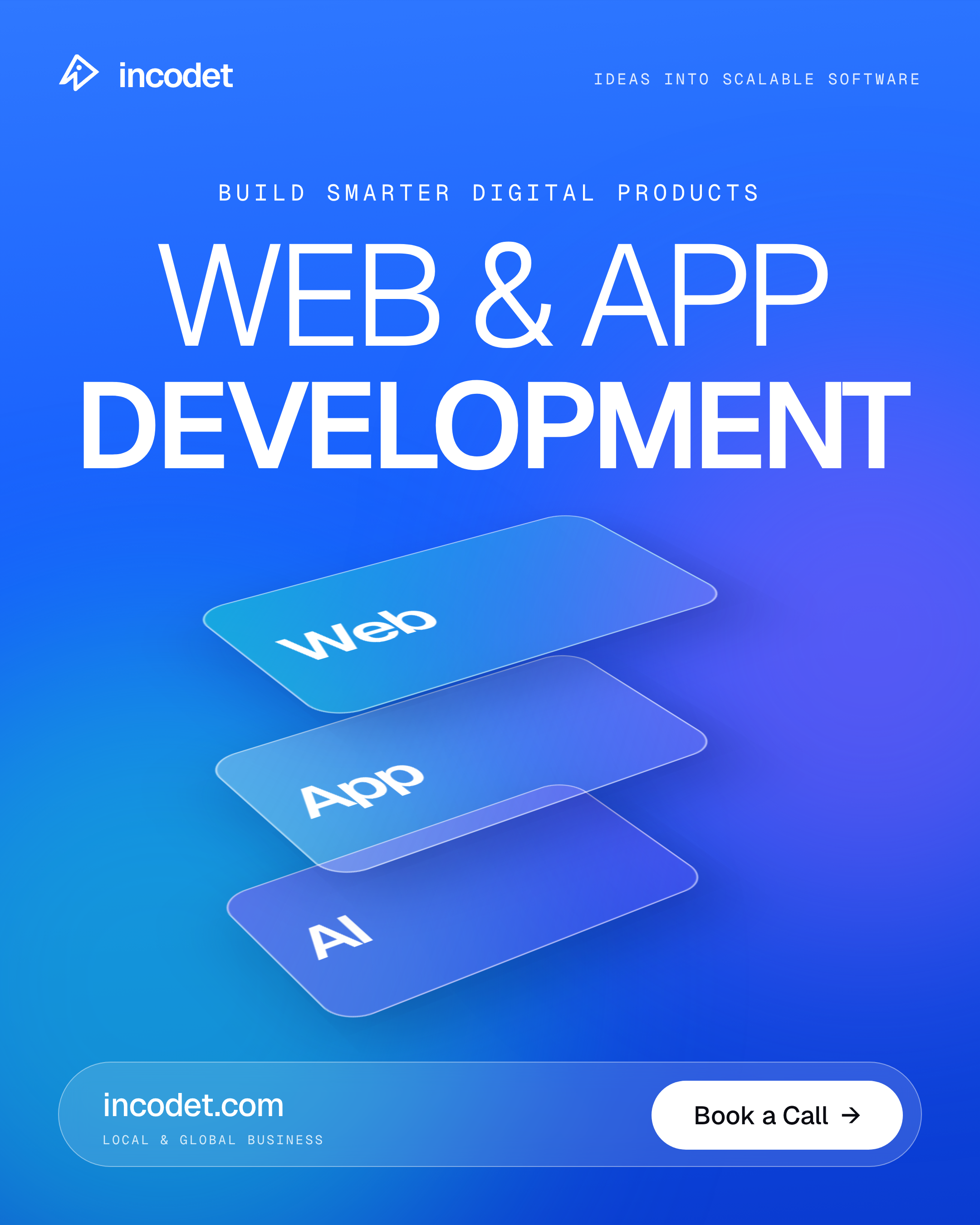
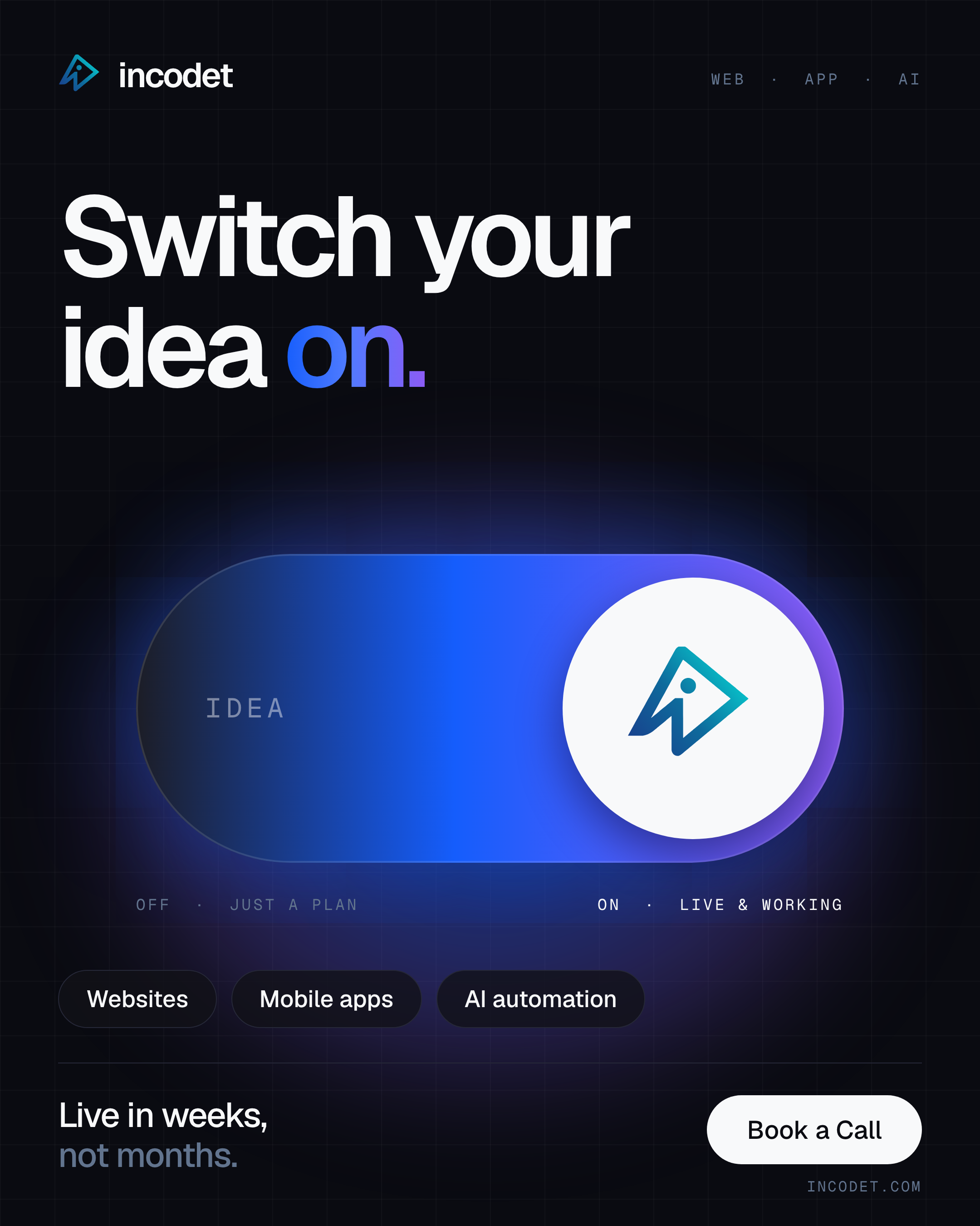
- 02. Bold and contemporary — large typography, strong color fields, blue-to-violet gradients, and simplified 3D elements. Instead of explaining every service in detail, these designs focus on one central message. Their purpose is to grab attention, communicate a clear idea, and establish a recognizable visual presence.
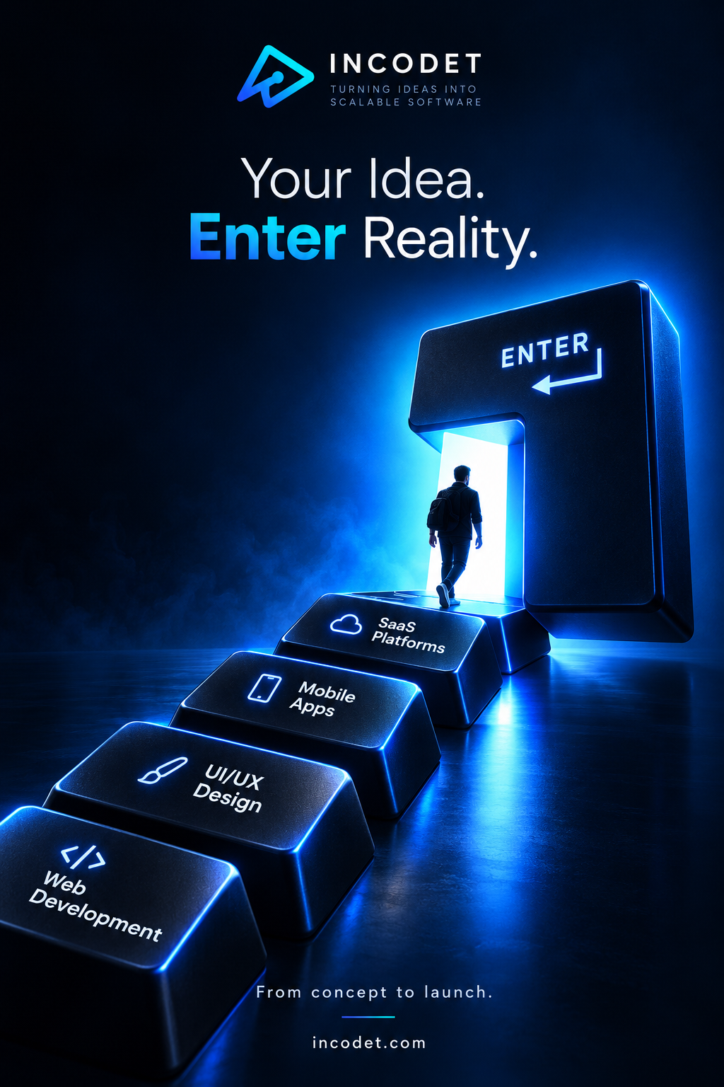
- 03. Cinematic and conceptual — glowing objects, reflective surfaces, atmospheric lighting, and futuristic compositions. These concepts use visual metaphors to communicate the transformation of ideas into real digital products. They give the brand a more expressive advertising style while retaining its core blue and cyan identity.
- Together, these approaches demonstrate how the same brand can support different visual moods without losing consistency.
Visual System
Although the individual pieces use different compositions, they follow a shared set of brand principles.
- Colour — the established Incodet palette provides the foundation: Ink (#0A0B11) for primary dark surfaces, Electric (#155DFC) as the main accent for headlines, buttons, and emphasis, Violet (#8B5CF6) as the secondary gradient accent, Teal (#10C4A0) as a supporting highlight, Slate (#62748E) for secondary text, and Mist (#F8F9FA) for light surfaces and primary text. The flyer and clean advertising concepts use more light space to improve readability, while the cinematic posters lean on dark navy and intense blue lighting.
- Typography — bold sans-serif typography establishes the main headlines, while smaller supporting copy explains the services or provides context. Large text creates a clear focal point in the posters, while the flyer and service-led graphics use more structured typography to organize multiple pieces of information.
- Composition and visual hierarchy — each design prioritizes one main message or visual element. Some rely on oversized headlines, while others use a dashboard interface, a conceptual object, or a sequence of service cards. Supporting information is arranged around this focal point rather than competing with it.
- Brand consistency — the Incodet symbol, wordmark, established color palette, and technology-focused visual language create continuity throughout the collection. The goal is not to make every piece identical, but to ensure each design feels like part of the same brand even when the layout, background, and visual concept change.
Design Process
The process began with the Incodet brand identity and design system, which established the visual rules used throughout the campaign.
I then organized the concepts around different marketing needs: explaining services, promoting website and app development, encouraging potential clients to start a project, and communicating the company’s overall positioning.
For each concept, I explored a central headline, supporting visual, color treatment, and layout. I used interface mockups, typography, 3D-style imagery, and graphic elements to develop different ways of communicating the same brand message.
The designs were then brought together as a multi-format collection, balancing informational layouts with more expressive and conceptual advertising treatments.
The Outcome
The result is a collection of six promotional design concepts for Incodet, covering an A4 flyer, service-led advertising graphics, and conceptual posters.
The collection demonstrates how a single brand identity can be adapted to different communication goals, from explaining services clearly to creating a more memorable visual statement.
The range of compositions also establishes a foundation for future marketing materials, allowing Incodet to explore new messages and formats while maintaining a consistent visual presence.
Key Takeaway
Effective advertising design begins with a clear message. Typography, composition, color, and imagery should work together to make that message easy to understand and difficult to overlook.
Through this project, I explored how Incodet’s identity can move beyond a logo and color palette into a flexible visual language for service promotion and brand storytelling.
The aim was to make complex digital services more approachable while giving the brand a confident, contemporary, and recognizable presence.
Project details
- Project
- Incodet — Ad Creatives, Posters & Flyers
- Brand
- Incodet
- Project Type
- Concept advertising and promotional design collection
- Deliverables
- Six design concepts, including one A4 flyer, digital ad creatives, and promotional posters
- Intended Uses
- Social media, digital campaigns, service promotion, and informational marketing
- Focus Areas
- Art direction, advertising design, visual hierarchy, typography, digital branding, conceptual imagery, layout design, and calls to action